
I know website owners struggle to get attention among millions of sites on the Internet. And I’m sure they are doing what they think is the best way to attract and keep visitors.
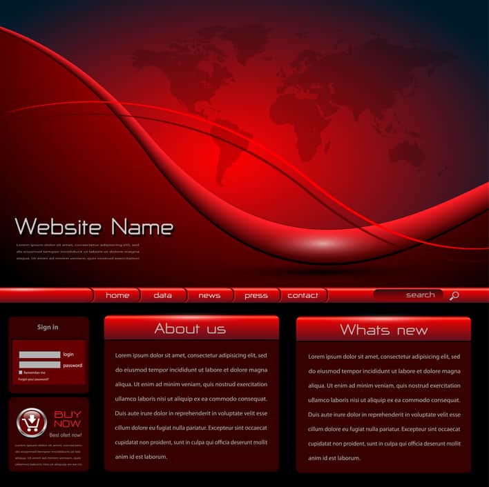
However, for many people a red background with tiny font or a white background with pale text just isn’t readable if we have even minor vision problems. I’m disappointed when I come across a blog or an article I want to read, then discover it”s just not worth the effort it takes to decipher it.
Now, you may think you don’t mind losing a few visually-impaired readers to have your great-looking website. Or you may think that the vision issues of individuals searching the Internet is their problem, not yours.
But there two things to consider:
1) More prospective customers, readers, followers, or fans than you realize may find it difficult to read your page. Even if they are far from blind, many people have difficulty reading webpages that are cluttered with busy elements (complicated menus, videos that start automatically, lots of graphics, and pop-up ads) and pages with low contrast (dark text on a black background or pale text on a white background). You may be losing more people than you know.
2) Even people with normal vision may prefer simpler, easier-to-read pages. They can fight through all the clutter to the text, but they prefer not to. They would rather look for the information on a site that is less challenging to read and navigate.
So, it’s up to you to make your site appealing to a wide range of tastes and abilities. In two weeks, my associate, Jan McClintock, will share some advice on how to do that.
You can find some basic information about starting a blog at How to Make a Website. Information about the cost of designing a website can be found at Guide to Website Costs – Namechk.
Image: © Depositphotos.com/cobal88